Dubai's Worst Corporate Logos
Here is my personal list of the 5 worst logos of Dubai based companies/organisations. I might have missed out on a few other masterpieces - in which case do drop me a comment and I shall try to include them among the 'other five'.
5. National Bank of Dubai
 There was a time when NBD was perceived as 'unfriendly' and 'arrogant' offering 'poor customer service'. Landor's million dollar solution came in the form of a curve with radio waves representing the 'willing-to-listen' change in their outlook. 6 years on NBD seems every bit arrogant as it was and the logo still reminds me of a dysfunctional speaker.
Agency - Landor - Depite the usual reviews claiming it creates a 'positive subconscious impact' on a customer, not their best work, I think.
4. DTCM
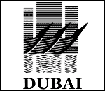 The first time someone sent me the DTCM logo to be used in an artwork, I mistook it for a badly scanned fax of a surreal painting. Fortunately, my fascination lasted only till I visited their website where they haven't displayed it too proudly either.
Agency - (Dan Brown or Da Vinci Code, whichever came first)
3. National Bonds
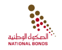 The circles are back again. This time, there are quite a few representing two arrows pointing upwards. Believe me, advertising agencies like Grey Worldwide have people who can convince that a silhouette of the World Trade Centre will make an ideal logo for an airline company.
Agency - Grey Worldwide (The supporting advertising campaign was equally unimaginative.)
2. Dubai eGovernment
 What do you get when you make the 'e' which represents the worst software ever produced to resemble the monster in the world's most famous arcade game. The enigmatic Dubai eGovernment logo; not Monster Truck Madness, silly.
Creative Agency - Unknown (Their press release does not specify the agency but comes up with an interesting observation regarding the logo.)
And the winner is..
1. I & M Galadari Group
 Whoever convinced I & M Galadari Group that a half-hearted attempt by a bored marketing manager to create two lines and a circle in Adobe Illustrator could represent their corporate identity must be lauded - because they still stick to this illogical piece of crap which is supposed to resemble the sun and the sea.
Agency - Unknown(My money is on the bored marketing manager or the chairman's kid.)
5. National Bank of Dubai
 There was a time when NBD was perceived as 'unfriendly' and 'arrogant' offering 'poor customer service'. Landor's million dollar solution came in the form of a curve with radio waves representing the 'willing-to-listen' change in their outlook. 6 years on NBD seems every bit arrogant as it was and the logo still reminds me of a dysfunctional speaker.
Agency - Landor - Depite the usual reviews claiming it creates a 'positive subconscious impact' on a customer, not their best work, I think.
4. DTCM
 The first time someone sent me the DTCM logo to be used in an artwork, I mistook it for a badly scanned fax of a surreal painting. Fortunately, my fascination lasted only till I visited their website where they haven't displayed it too proudly either.
Agency - (Dan Brown or Da Vinci Code, whichever came first)
3. National Bonds
 The circles are back again. This time, there are quite a few representing two arrows pointing upwards. Believe me, advertising agencies like Grey Worldwide have people who can convince that a silhouette of the World Trade Centre will make an ideal logo for an airline company.
Agency - Grey Worldwide (The supporting advertising campaign was equally unimaginative.)
2. Dubai eGovernment
 What do you get when you make the 'e' which represents the worst software ever produced to resemble the monster in the world's most famous arcade game. The enigmatic Dubai eGovernment logo; not Monster Truck Madness, silly.
Creative Agency - Unknown (Their press release does not specify the agency but comes up with an interesting observation regarding the logo.)
And the winner is..
1. I & M Galadari Group
 Whoever convinced I & M Galadari Group that a half-hearted attempt by a bored marketing manager to create two lines and a circle in Adobe Illustrator could represent their corporate identity must be lauded - because they still stick to this illogical piece of crap which is supposed to resemble the sun and the sea.
Agency - Unknown(My money is on the bored marketing manager or the chairman's kid.)





12 Comments:
Great Effort. I personally dont think NBD's logo is that bad. With the text on its side, it looks okay.
Rest are recycled junk. I cant believe that e-gov, I&M Galadari and National Bonds use those logs.
Btw, I never noticed them. Thanks for highlighting. Great post.
Yes, good post.
It's not only local designers who come up with questionable stuff.
Around the world I've seen far too many where the design is done first, then the rationale written to fit it.
And having worked on both the agency and client side, I believe the client has a huge responsibility to be qualified enough to reject rubbish. Too many aren't and don't.
Ahmed,
I took NBD's because it it is a bit over-hyped. I know there are a few more out there which are far worse.
Seabee,
Absolutely. The National Bonds for example, quite obviously belongs to that category.
NBD's logo is just a simplified side view of their HQ building.
Now you have to give us the 5 best...
Yeah. I think that was one of the reasons why it got approved.
I was trying to put together the best 5 - not that easy ;)
NBD apparently signifies a sail, used by arab dhows, for centuries of trade, and also reflects the HO building, as Keefie explained.
I & M Galadari--could it possibly win the worst ever logo in the history of the world award? Possibly, though it has stiif competition from national bonds and e-gov. To me, it looks like a guy doing sit-ups.
(My money is on the bored marketing manager or the chairman's kid.)
Mine's on the chairman's dog. Or his one-legged, blind camel.
I like this post as well.. I can't believe National Bonds came out of Grey's studios...
Reminds me of the Dubai Holding thing with LB
These truly suck. Thought I don't agree whole-heartedly with your 'Best' list but these ones are brilliantly...poor.
Now is the best time to see which company has the worst tagline...lol!
md,
@the tagline. Not a bad idea at all ;)
My dad who worked in the advertising industry in dubai stated that the two worst logos according to him are Dubai Police & Khaleej Times.
Dubai’s short-term rental market is booming, but managing holiday homes requires consistency and expertise. With Suiteable Dubai, property owners get end-to-end solutions that take care of everything, from interior design packages to attentive guest management. Their team is known for professionalism, transparency, and monthly reporting that keeps owners fully informed. Guests enjoy luxury stays in prime locations, while landlords enjoy stress-free management and optimized returns. Whether it’s a studio, beachfront villa, or a high-rise apartment, Suiteable ensures every property stands out in a competitive market.
Post a Comment
<< Home