The Best Corporate Logos in Dubai
Now this is the difficult part. It is really not easy to judge a logo on how successful it is in terms of representing the brand identity, aesthetics, creativity, signifying the product category, impact on the customer depending on the type of the product and a regional relevance, if at all it is important for the product.
I did ponder on some of the more fanciful logos like that of City of Arabia (development by I & M Galadari ironically), Thuraya and Dubai World Central, but settled on these five. You are all welcome to differ.
5. i-mate
 Not many of you would know that the 'i-mate' which is being marketed in over 100 countries is actually a 'Dubai brand'. The global appeal of such a brand is vital to the success of the product. i-mate went for a no-nonsense logo representing 'a modern and reliable brand' with a reasonable typographic uniqueness and clarity.
Agency: Created by Jim Morrisson, the CEO of i-Mate. (Thanks to Martin at FlipCorp for the update)
4. Burjuman
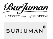 If the old Burjuman logo was all class with a typographic flourish, the new one broke away from the complicated and sometimes tacky logos of other malls in Dubai. A brand known for it's consistency and to some extent, creativety in advertising and marketing, Burjuman has got the basics right as far as their logo is concerned.
Agency: Team Y & R (B is for Burjuman, that is until Bloomingdales gets to Dubai)
3. Emirates Airlines
 They can be excused for choosing an unimaginative name and a Calligraphic logo(they were one of the earliest ones though), but like Burjuman they got their basics right, they improvised (wisely avoided using the Arabic Calligraphy logo in the international market after 9/11) and were always consistent with their branding all the while maintaining the faintest of links to the region with the help of a beautifully designed custom typeface.
Agency: Impact BBDO (I am not quite sure)
2. Flip Media
 'Unique and unexpected. Effective and business driven. Surprising with innovative technology.' - says Flipcorp. Atleast the logo tries to live up to the claim. Flip you will. But not the way they flipped Wordpress, I hope.
Agency: Designed by Dinesh Lalvani, founder and managing partner of Flip Corp. No one-eyed camels this time. Thanks to Martin at Flip Corp for the info.)
1. du
 When the company has a name which sounds far more exciting than 'Etisalat' or 'another Burj in the name of Jumeirah', the branding agency is bound get carried away. Leo Burnett did not and the result is a logo which looks clean, professional and above all makes sense. Too early to say how well it will perform but having an image of Etisalat 2 wouldn't have helped them much in any case.
Agency : Leo Burnett (Kind of made of for their lacklustre effort with Dubai Holding).
Update: Turqouise, a UK-based branding agency seems to have created the logo. Thanks again to Martin for pointing it out.)
I did ponder on some of the more fanciful logos like that of City of Arabia (development by I & M Galadari ironically), Thuraya and Dubai World Central, but settled on these five. You are all welcome to differ.
5. i-mate
 Not many of you would know that the 'i-mate' which is being marketed in over 100 countries is actually a 'Dubai brand'. The global appeal of such a brand is vital to the success of the product. i-mate went for a no-nonsense logo representing 'a modern and reliable brand' with a reasonable typographic uniqueness and clarity.
Agency: Created by Jim Morrisson, the CEO of i-Mate. (Thanks to Martin at FlipCorp for the update)
4. Burjuman
 If the old Burjuman logo was all class with a typographic flourish, the new one broke away from the complicated and sometimes tacky logos of other malls in Dubai. A brand known for it's consistency and to some extent, creativety in advertising and marketing, Burjuman has got the basics right as far as their logo is concerned.
Agency: Team Y & R (B is for Burjuman, that is until Bloomingdales gets to Dubai)
3. Emirates Airlines
 They can be excused for choosing an unimaginative name and a Calligraphic logo(they were one of the earliest ones though), but like Burjuman they got their basics right, they improvised (wisely avoided using the Arabic Calligraphy logo in the international market after 9/11) and were always consistent with their branding all the while maintaining the faintest of links to the region with the help of a beautifully designed custom typeface.
Agency: Impact BBDO (I am not quite sure)
2. Flip Media
 'Unique and unexpected. Effective and business driven. Surprising with innovative technology.' - says Flipcorp. Atleast the logo tries to live up to the claim. Flip you will. But not the way they flipped Wordpress, I hope.
Agency: Designed by Dinesh Lalvani, founder and managing partner of Flip Corp. No one-eyed camels this time. Thanks to Martin at Flip Corp for the info.)
1. du
 When the company has a name which sounds far more exciting than 'Etisalat' or 'another Burj in the name of Jumeirah', the branding agency is bound get carried away. Leo Burnett did not and the result is a logo which looks clean, professional and above all makes sense. Too early to say how well it will perform but having an image of Etisalat 2 wouldn't have helped them much in any case.
Agency : Leo Burnett (Kind of made of for their lacklustre effort with Dubai Holding).
Update: Turqouise, a UK-based branding agency seems to have created the logo. Thanks again to Martin for pointing it out.)




20 Comments:
'Not many of you would know that the 'i-mate' which is being marketed in over 100 countries is actually a 'Dubai brand'.
What do you mean by 'i-mate' being a Dubai brand?
Even though the product was first launched in Europe, i-mate as a brand was established in Dubai where the company headquarters is now situated.
I love the Flip logo but I've never heard of the company - what do they do?
Keefieboy,
They are an interactive media agency. http://flipcorp.com/
Somehow the "du" logo reminds me of tampons...
for fairness sake, LB didn't design nither DU nor DH logos... Du was by a CI design house in Europe who worked closely with the account team in LB...
Dubai Holding logo was created 100% in-house. LB tried to convince DH to change it (remove the Nike-bit)... but i am sure you know how these things work... :)
oh and to 'A world of Symphony' .. woke is 100% correct on I-mate.
As a matter of fact, i orchestrated i-mate's first public appearance in the media - (the photographer used my hand for the first ever product shoot)... Jim Morrison, the founder of Carrier Devices (the company that owns the i-mate brand) and a brilliant entrepreneur, got the OS license for his first bulky smart phone from Microsoft Middle East.
The launch was done in the Microsoft building in DIC. At the beginning, i-mate was manufactured by the makers of Q-Tek (a geeky PDA that’s obsolete now) in Korea to OEM i-mate. Then
i-mate worked extensively with Arabic mobile apps developers to come up localized apps for the ME market such as AE-EN dictionary, prayers alarms...etc
By that time, I-mate was signing up distis and they were rolling with marketing campaigns ...
Don’t know who manufactures i-mate now.. but they are doing well from what i know.
moryarti,
many thanks for the info. So the du logo is more like what Rareform did with FP7 Dubai for Etisalat.
Sadly, the DH logo will officially be credited (or discredited)to LB. How these things work..
Any idea on which agency did the i-mate branding?
Not sure who did i-mate... but i know it got a facelift a couple pf years back..
As we all know its not the name that makes a difference. We will see later this year how "du" will perform. So many people are looking forward to their launch...
fingers crossed things will change.
The Flip logo was developed by Dinesh Lalvani, founder and managing partner of Flip Media.
The Du logo was developed by a London based agency called Turqoise, including Du's whole brand architecture.
i-Mate is a creation of Scotsman Jim Morrisson, the CEO of i-Mate who I had a chance to met when he first landed in Dubai. Dinesh was one of the first person to test an i-mate phone in Dubai, although we all are now in love with our Blackberrys.
Thanks for voting Flip's logo #2 - I am sure Dinesh will like it.
Martin
Hello Martin,
Many thanks for the info. Will update it.
Despite enjoying the choice of 5 best and worst placed brands, I could not digest placing DU anywhere near the top brands.
Primarily speaking from an Intellectual Property mind, the very logo created is faulty. A logo cannot be copyrighted as it appears in DU logo ,rather it should have been Trademark. Wonder where did they got their Patent agents from? Nigeria?
From an aesthetic point of view, DU is no way remarkable. Stand out. Well if you are only two of a kind, then even an unregonizable and uncalled for logo for RTA will also stand out!
May be EthiSALAD has made you so damm angry that any kind of competitor (competitor!!) 's logo would have made to the top of your best brand list!
Abu,
It is a matter of opinion - I am aware that there are people who absolutely hates the du logo.
Maybe it doesn't do well that aesthetically, but I believe it works really well when it is integrated with other forms of communication.
Moreover a logo does not need a figurative representation - but a play with a typeface will do which communicates even better than what a normal logo does.
Just look at Coca-cola, Microsoft, Dell and the likes.
I hate du for the same reason I hate Etisalat- but du has a better platform than Eti for a start. 5 years from now, we will see how du will fare as a brand if at all some genuine competition arrives.
Thanks a lot for sharing. You have done a brilliant job. Your article is truly relevant to
my study at this moment, and I am really happy I discovered your website. However, I
would like to see more details about this topic. I'm going to keep coming back here.
really it had showed best media agency in Dubai. thank for this site.
Singapore Top Ten Brand Marketing Agency
I was working in UK but some months before I have worked with Advertising Agency Dubai and I want to recommend them they have an awesome web developers and designers and most important they deliver according to commitments and on time..
I have a gett even suggestion: File a trademark application for "Z." then send an infringement notice to origin.Intellectual property law firm India|Registered patent attorney India|Patent Registration in India
Are you looking for product registration in dubai? baslikli-sms.com.
Dubai corporate logos are creative. All corporate are doing customer supportive actions. If anyone need finance assistance, please get in touch
Corporate Loans UAE
Post a Comment
<< Home